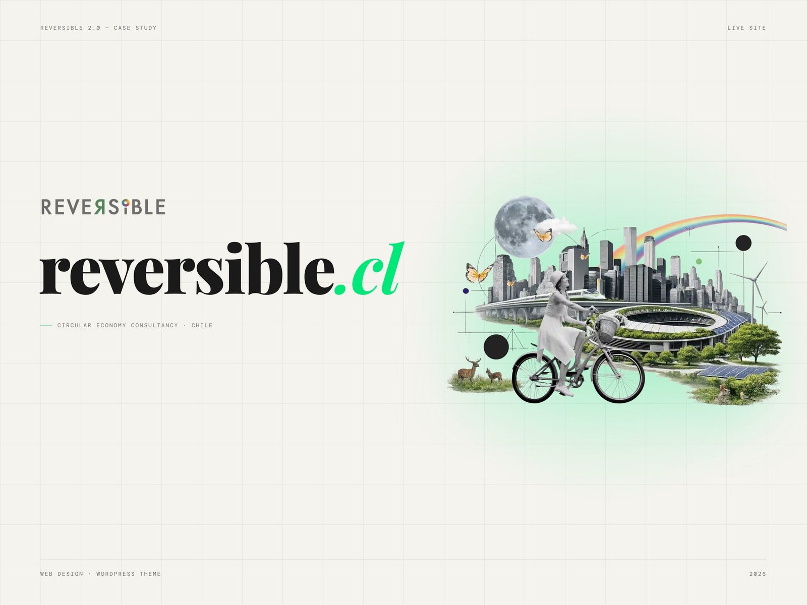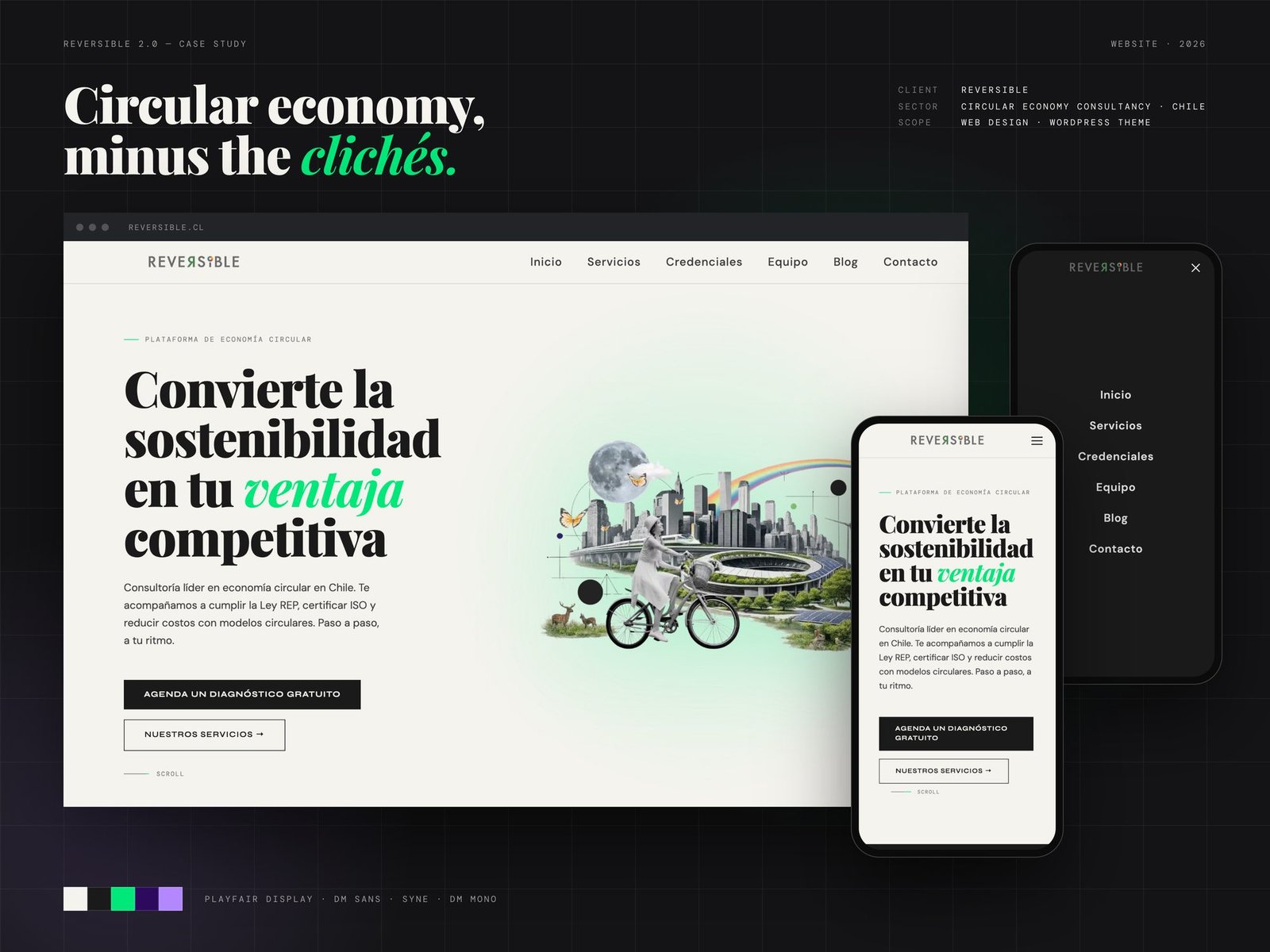
Circular economy, minus the clichés.
Where it started
Reversible's website went down and almost all of its content was lost. Restoring it wasn't enough: we designed it again as a 2.0, with a new structure and a minimal, functional visual style built on geometric shapes.
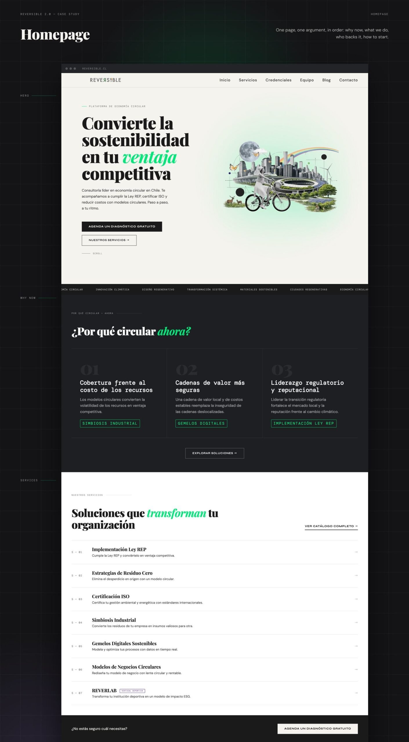
One page, one argument
The homepage makes one argument, in order: why now, what we do, who backs it, how to start. One primary action: book a free assessment.
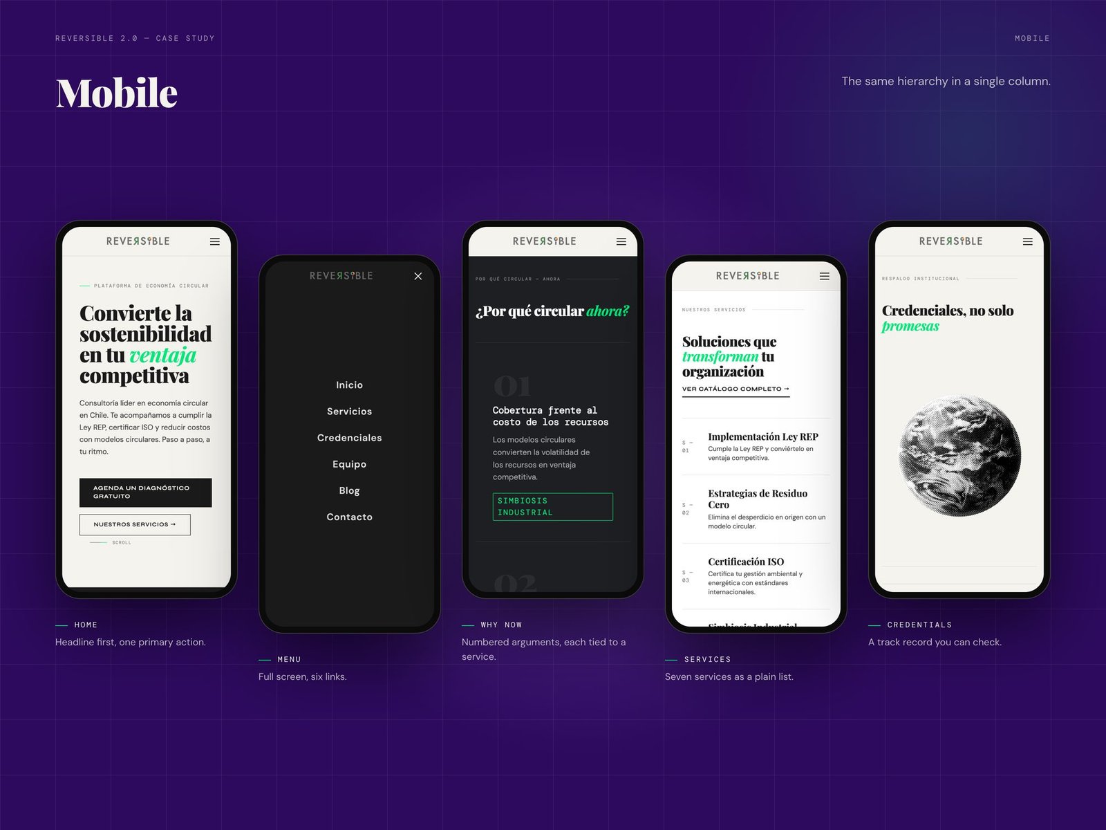
On the phone
The same hierarchy in a single column.
- Home: headline first, one primary action.
- Menu: full screen, six links.
- Why now: numbered arguments, each tied to a service.
- Services: all seven services as a plain list.
- Credentials: a track record you can check.
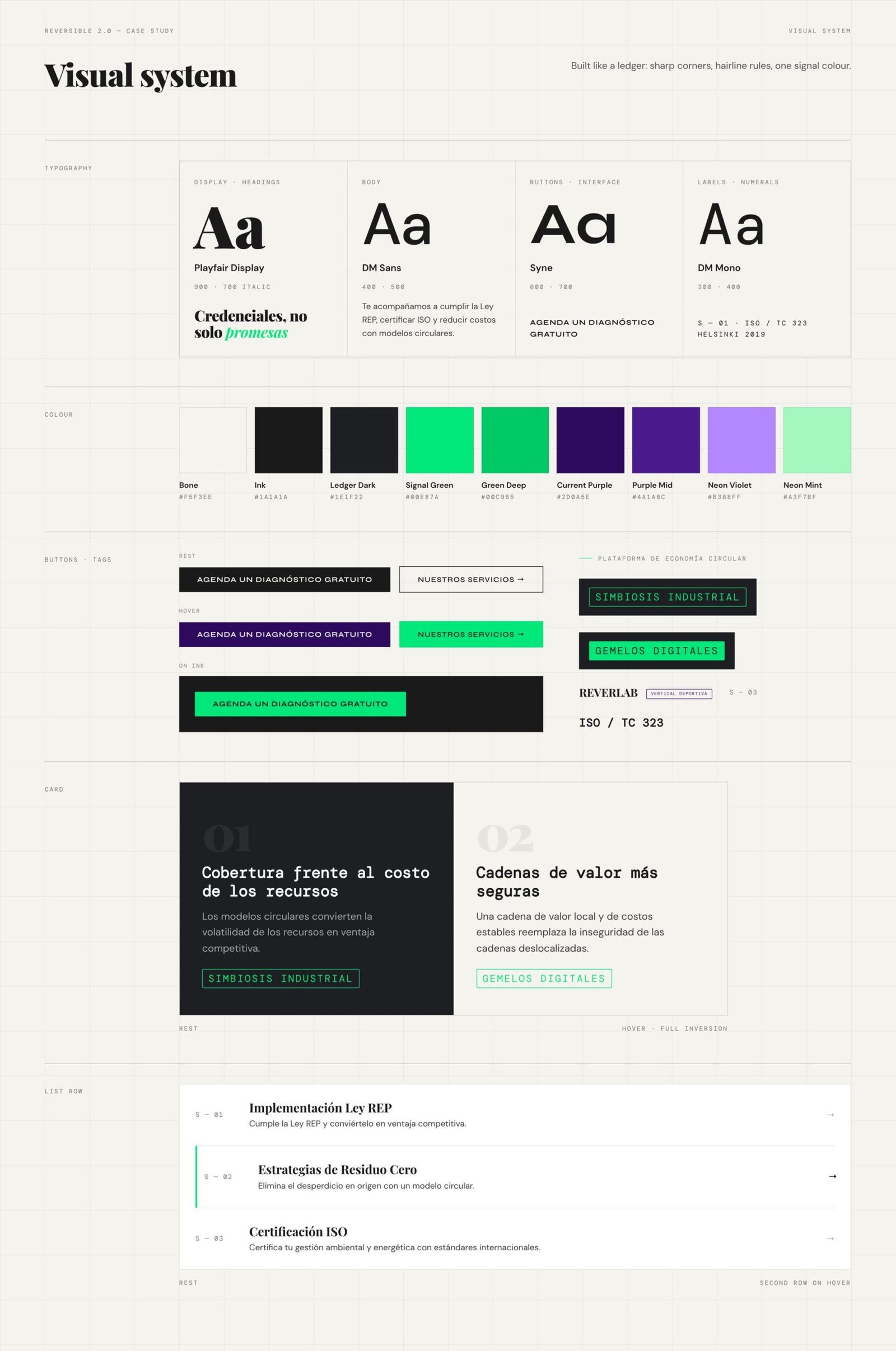
Visual system
Built like a ledger: sharp corners, hairline rules, one signal colour. Playfair Display for headings, DM Sans for body, Syne for buttons and DM Mono for labels and numerals. Signal green on bone and ink, with supporting purples.